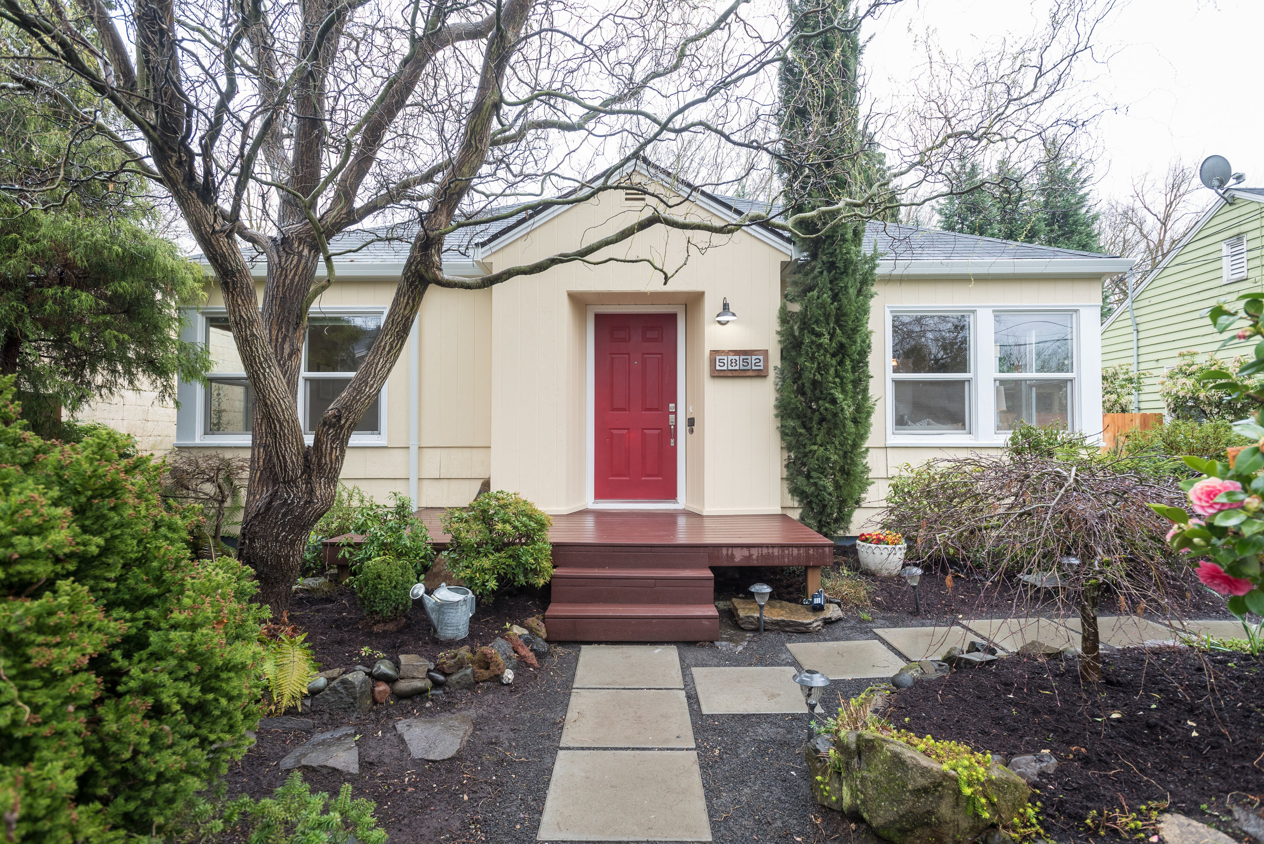
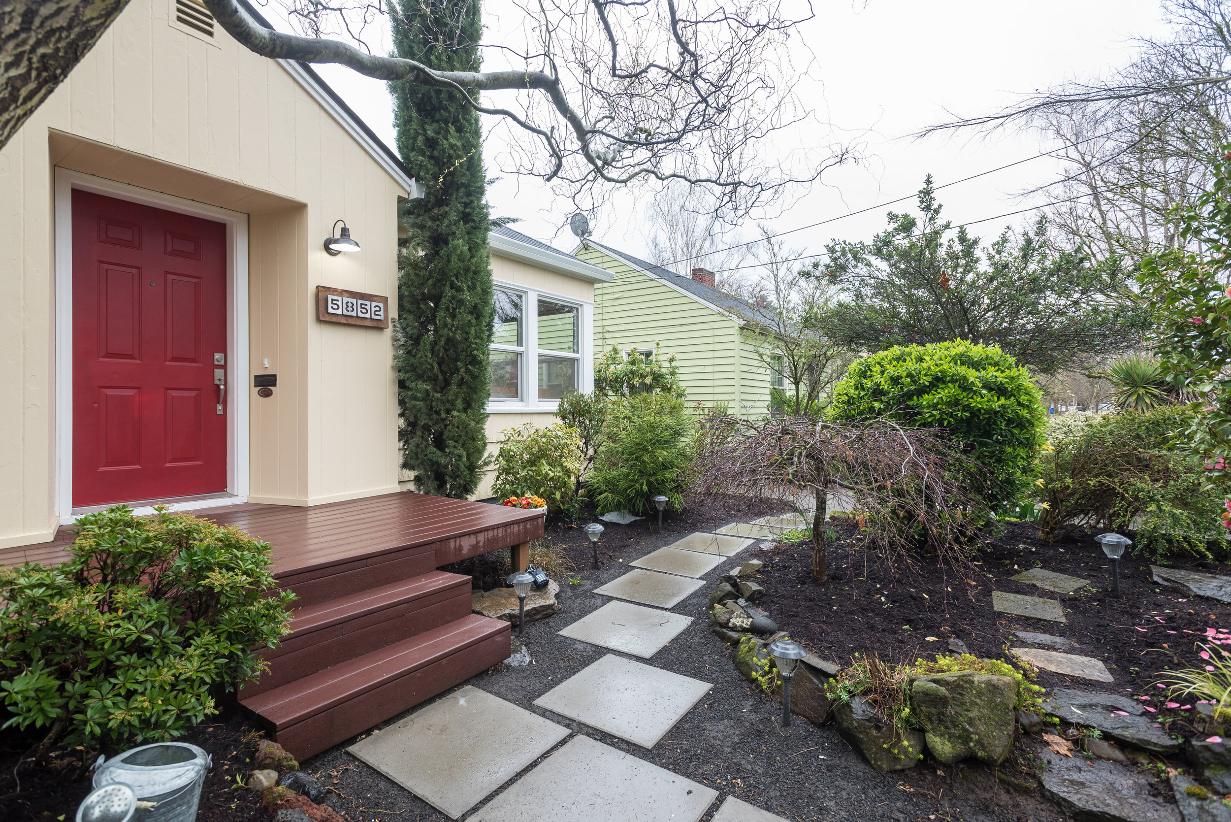
Adorable Sellwood Cottage

5852 SE 23rd Ave - Portland-005.jpg

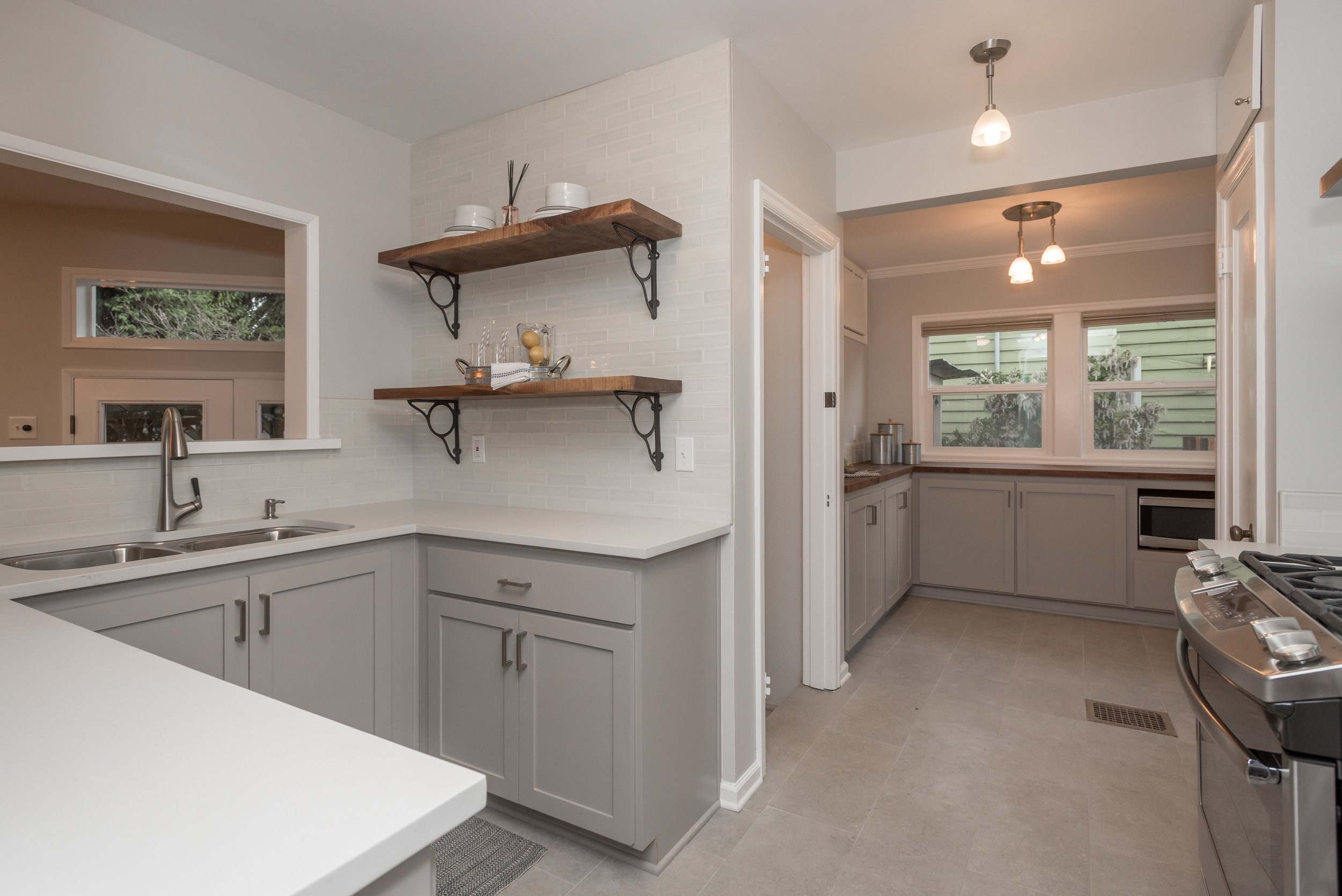
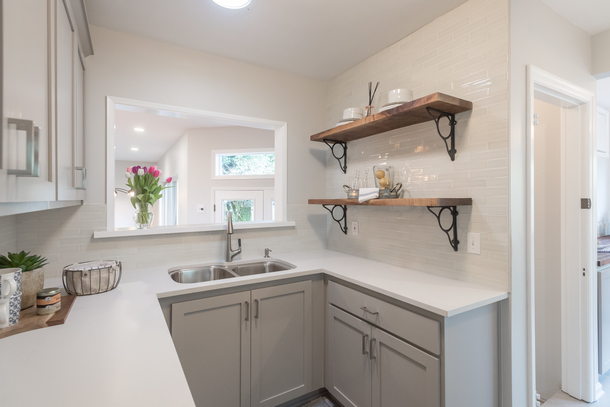
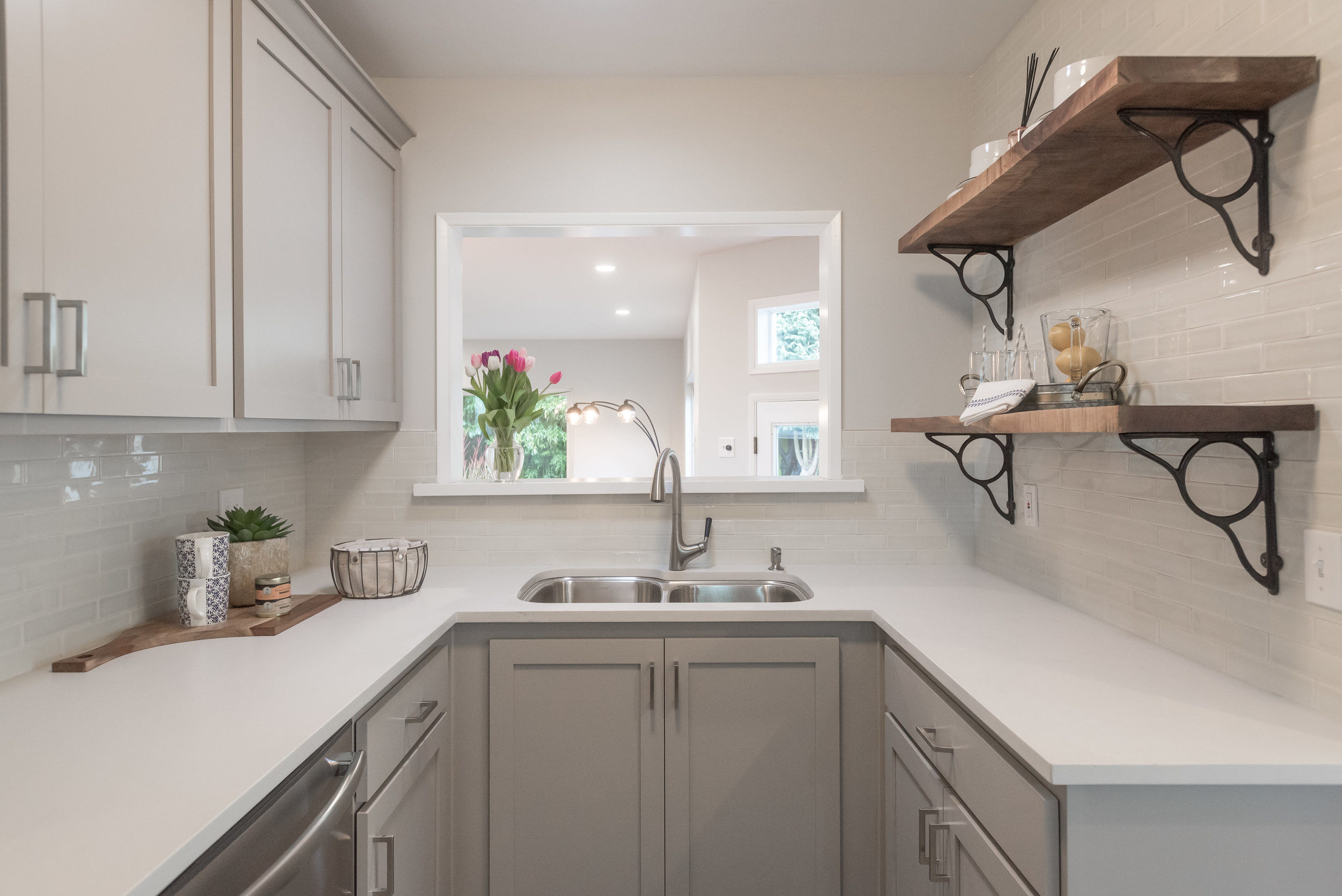
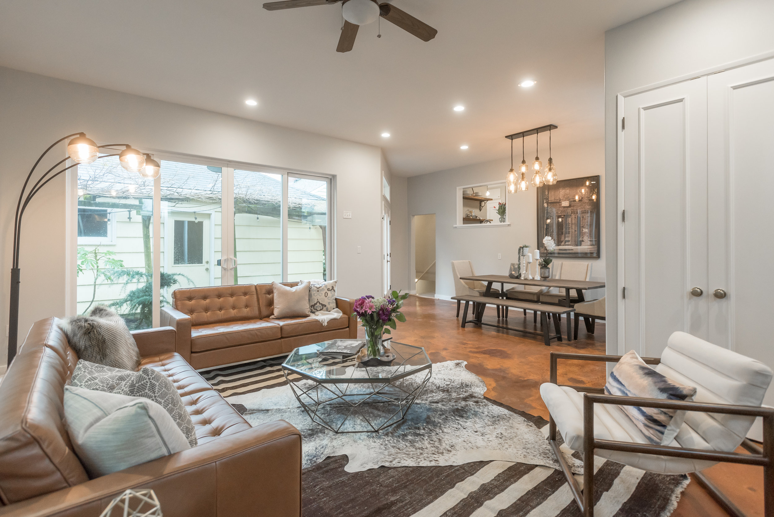
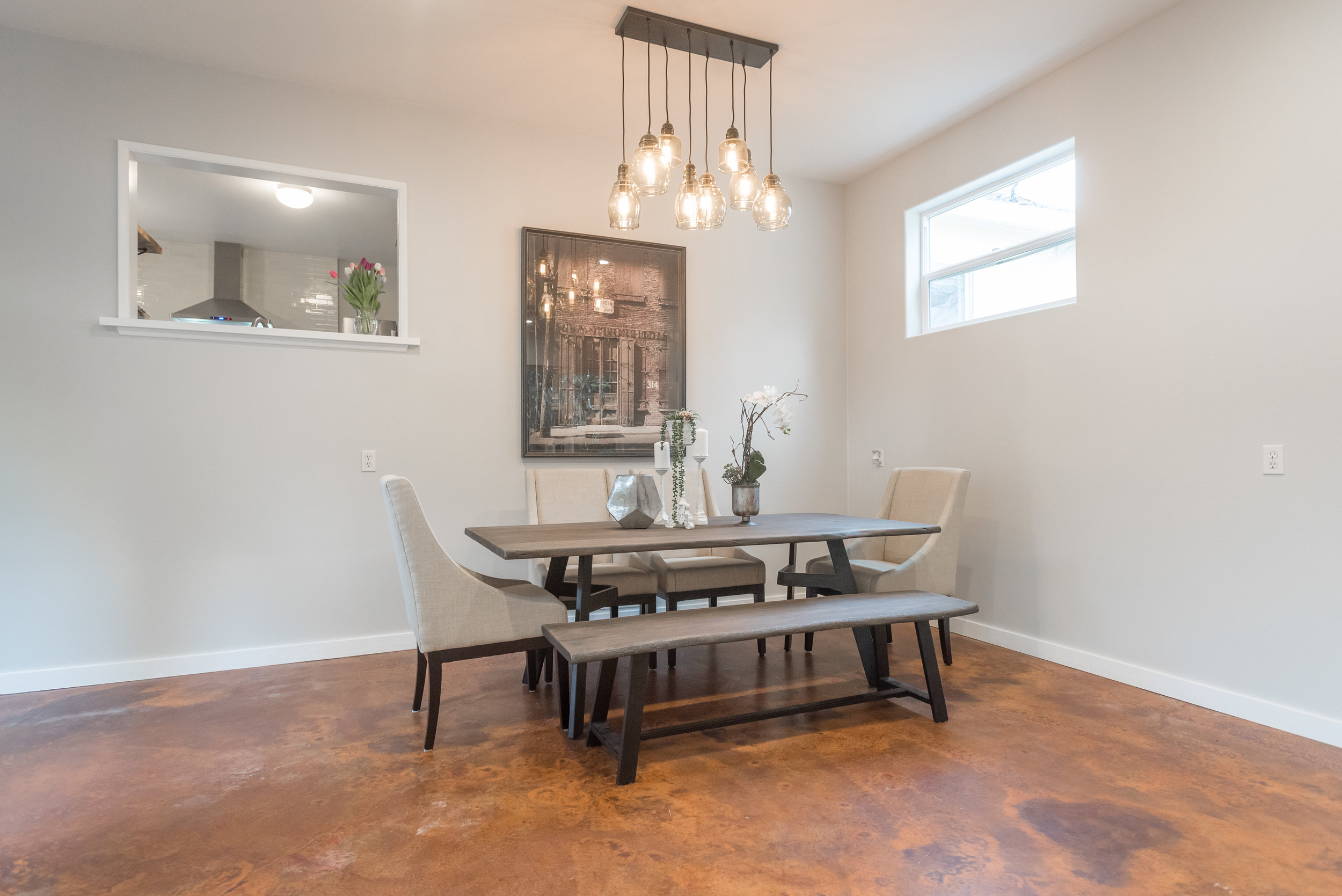
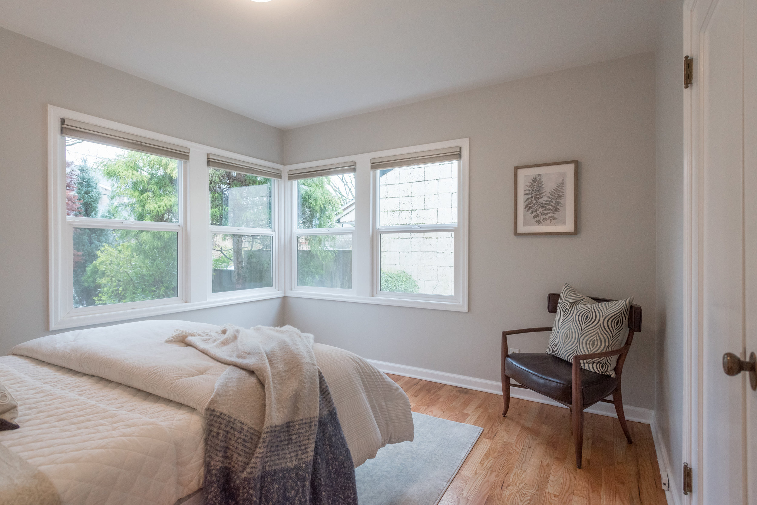
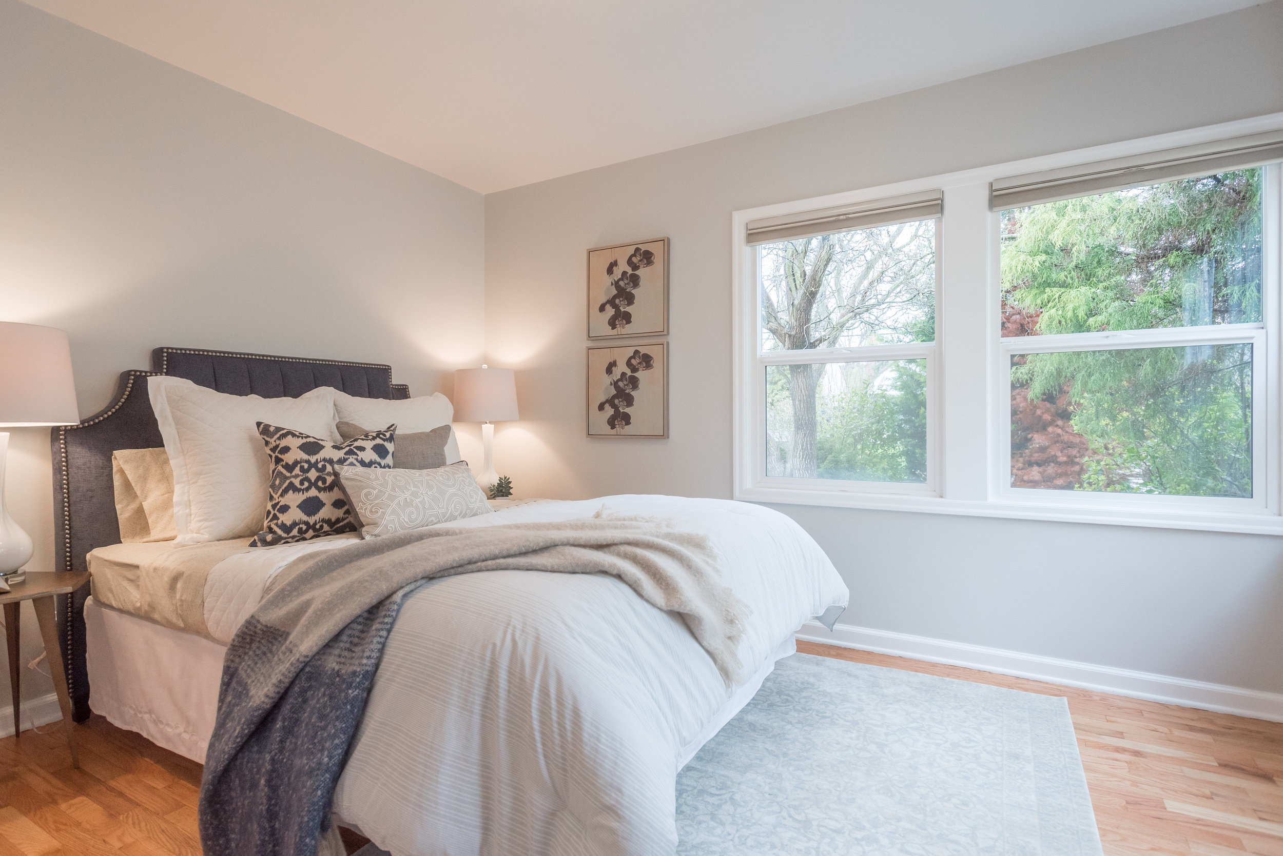
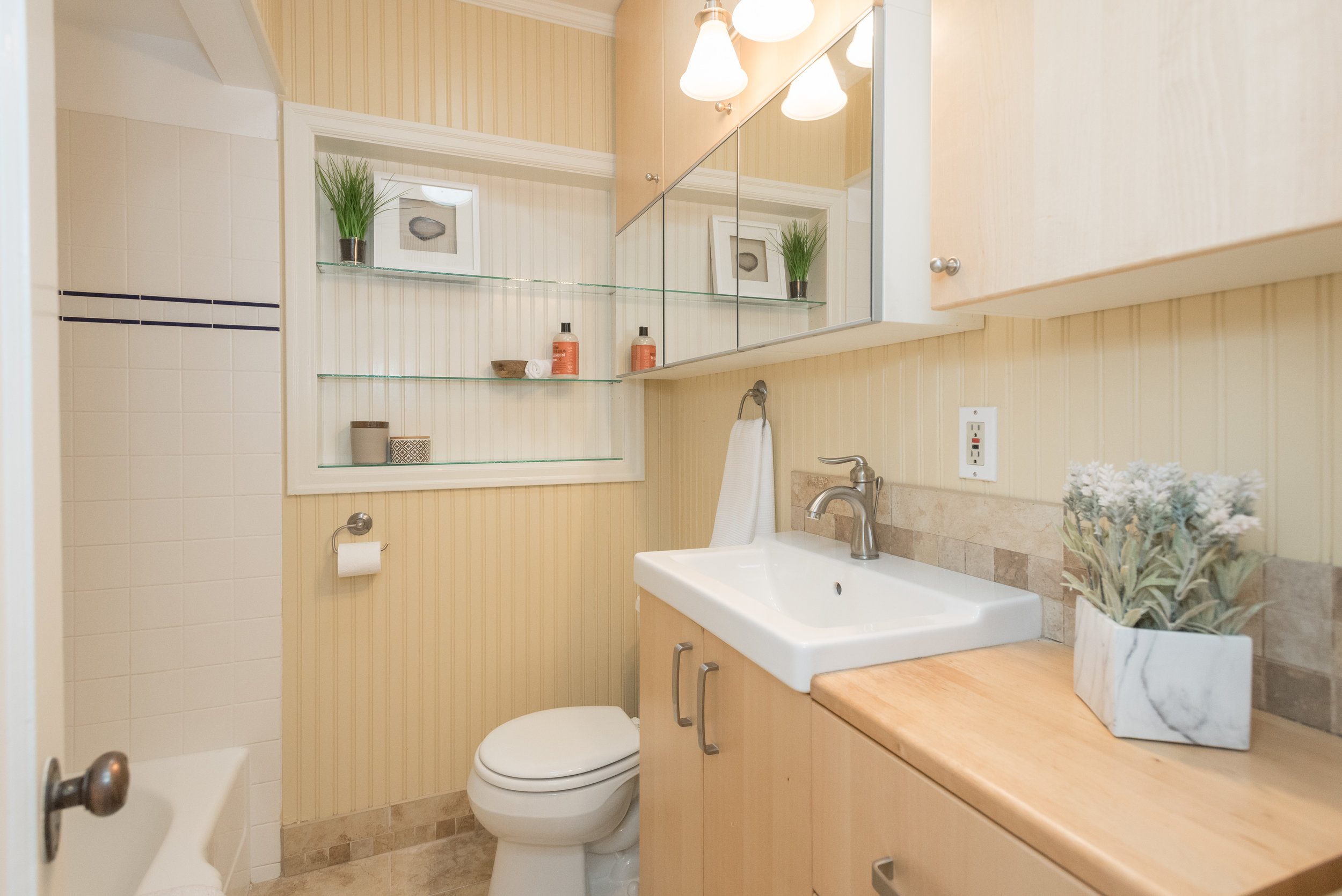
 This adorable Sellwood cottage has so much to offer. Not only is it cute and in a fantastic, hot, close-in neighborhood, it also has a brand new kitchen! The sellers were planning on staying for a long time, but had to move out of state for work. So, the new owner will benefit from this well thought out kitchen remodel. There are brand new cabinets, quart counters, raw edge wood slab shelves, butcher block counters, large tile flooring, and brand new stainless steel appliances. 

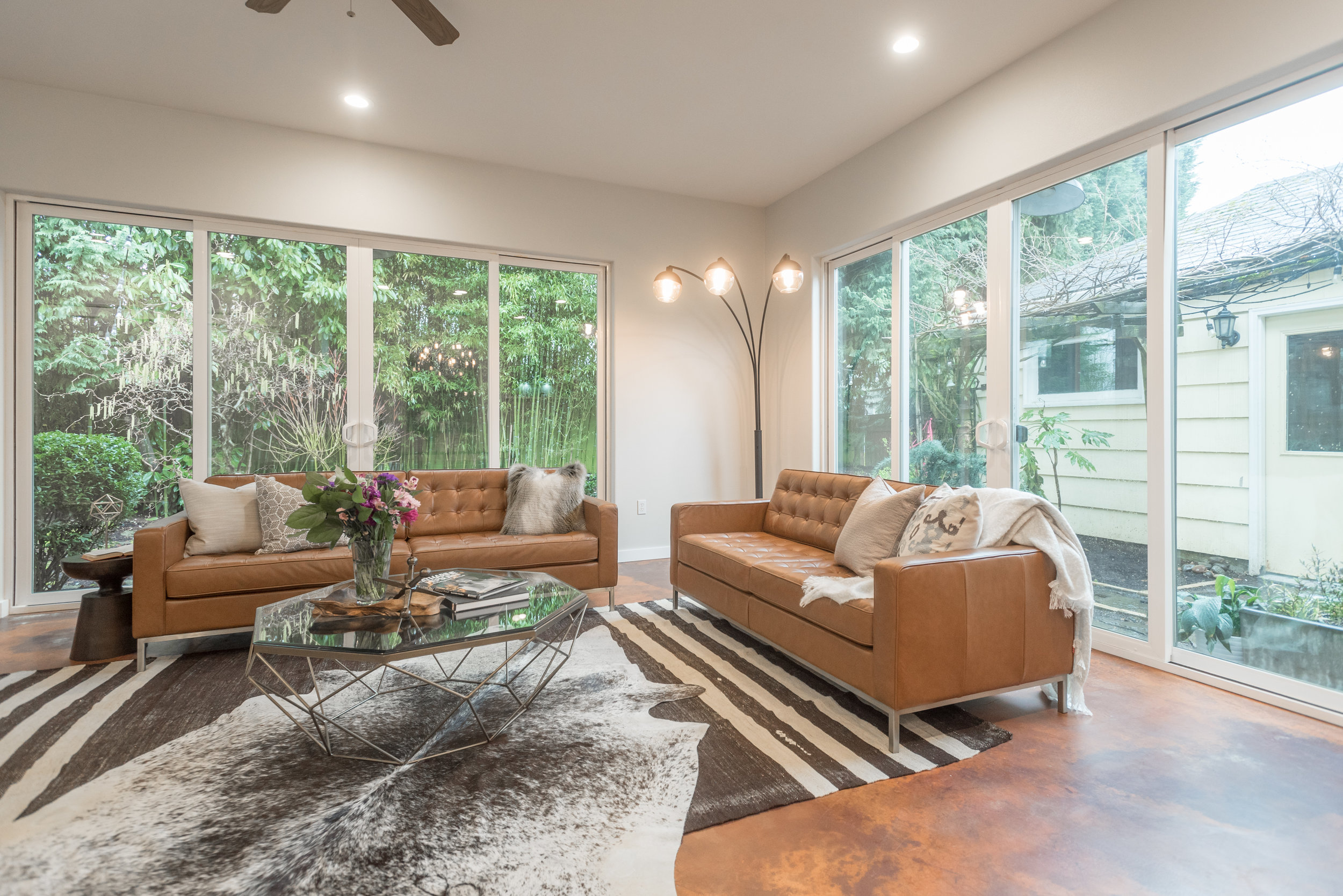
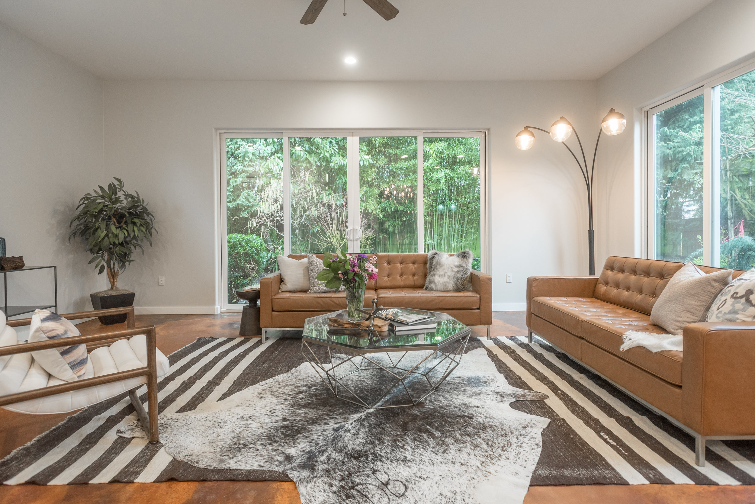
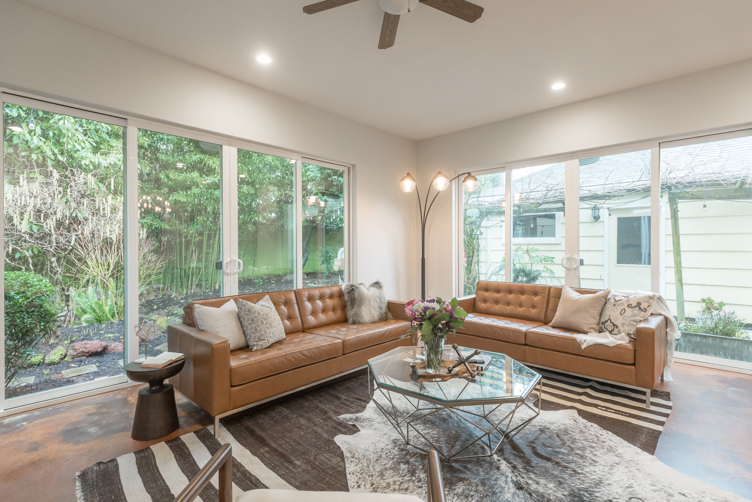
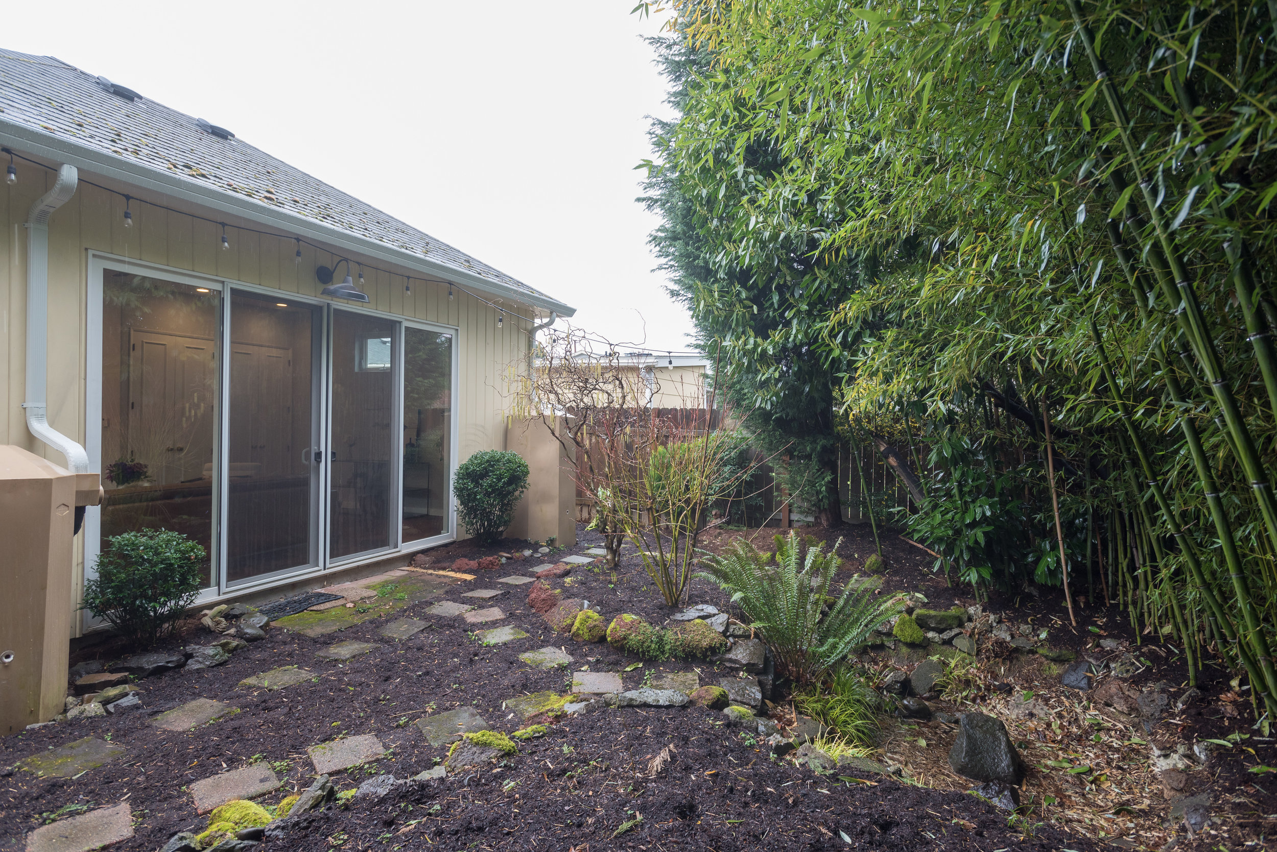
The large great room addition is a surprise for every one who comes to this home. Vaulted ceilings, oversized windows, and sliding doors bring the backyard oasis inside, and heated, stained concrete floors are durable and visually compelling.  

The basement is ready for a master suite! 

The City of Portland Home Energy Score is an 8, out of 10. A certified energy auditor assessed the home and it's systems, and gave it an 8 out of 10. The R-44 insulation in the attic, 96% AFUE gas furnace, and double paned low-E glass windows helped the home earn such a high score. Read the details here: https://api.greenbuildingregistry.com/report/pdf/R328404-20180129.pdf

Come visit me Saturday and Sunday, March 17th and 18th, from noon to 3pm for the Open House. 


Portland Market is Still Hot, but Nothing Compared to Seattle!

Portland.jpg

Do you ever feel like Portland is always looped in with Seattle, but as a slightly behind, quaint, lesser, suburb, wannabe? When it comes to the rising house prices, that's turning out to not be a bad thing! Let's take a little walk through some of the statistics! Seattle home prices have increased nearly 9% since January 1st, 2017, leading all cities. Portland is at a not shabby at all 7%. To put this in context, 3% per year is the average rise in home prices year to year since the 1970s. 

Our population is growing, but the growth in GDP is not as great as the other hot market cities. This is a little worrisome, but unemployment is so so low, 3.7% in Portland, 4.2% in Oregon, that salaries will hopefully start going up soon. 

The median home price in Portland is $404,500, and in Seattle it's $708,600. 

You guys. 57%. The median house in Portland is 43% lower! So we don't have professional baseball or football. We have a smaller opera, ballet, etc. Less big boats. I'm ok with this! 

Let me know if you want to get a foothold in our amazing little city! 


Home Energy Scores Are Coming

Home-Energy-score-graphic.jpg

A new and interesting step in selling your Portland home is coming next month. The Home Energy Audit is intended to let buyers compare homes more accurately. 

As of January 1, 2018, the City of Portland will require that all homes within the city limits attain a home energy score from a qualified home energy assessor prior to going on the market. Similar to how miles per gallon can quickly convey how efficient a car is, a home energy score is intended to let potential buyers know how efficient a home is.

The Home Energy Score is a measurement of the energy efficiency of a home based on an onsite evaluation of the physical characteristics of the house. A Home Energy Score is not a measurement of the household's actual energy usage, which is influenced by occupant behavior. 

If your home scores a 5, it is expected to perform comparably to an average home in Portland in terms of energy use. If your home scores a 10, it ranks among the 10 percent of homes expected to use the least amount of energy. A home scoring a 1 is estimated to consume more energy each year than 85 percent of homes.

Scoring a 1 does not mean your home is poorly built. A beautiful home with up-to-date equipment can still get a low score if the square footage is high or if there is insufficient insulation. A low score just means there is significant room for improvement to reduce a home’s energy use. Scoring a 10 does not mean your home cannot improve. Even a home that uses less energy than most of its peers may benefit from additional energy efficiency or renewable energy investments. 

During a home energy assessment, the home's heating and cooling equipment, ductwork, water heater, insulation, windows and roofing are examined and collected data is entered into a program. A score of 1-10 is generated for the home in question, as well as recommended improvements that can raise the home's score and increase efficiency. The assessment is not destructive or invasive. 

There are several inspectors who have been certified, and I've seen costs ranging from $150-200. That's not bad compared to a pre-listing home inspection ($400-600). If you have any questions about selling your home, or obtaining an audit, please don't hesitate to reach out to me! 

I've Found a New Home

IMG_20180312_140009680 (1).jpg

I have found a new home! It's been 6.5 years since I moved brokerages, and I have never really shopped around seriously. I just took the next step right in front of me. This week, starting Monday morning at 9am, I started to really explore where I could fit in and be encouraged to grow to be the best Realtor in Portland and SW Washington. I found that place at Dwell Realty. The culture of a brokerage I'd really important, and I know it is tomy clients as well.

Portland Is for Pets

Portland: It's raining. Also, we have cats and dogs.

In fact, Oregon is one of the few states in the nation with more cat owners than dog owners, but Portland proper belongs to the hounds.

We're tied for first in the country with the most dog parks per capita (slipping a bit from 2012, when Portland led that category "fur and away") and our dog ownership rate is 38.8%.

But dog parks and catios are only part of what makes a city statistically welcoming to our canine and feline family members. WalletHub recently performed this ridiculously in-depth study on the nation's most pet friendly cities... and Portland is ranked all the way down in 26th place! This, despite receiving very high marks in both the "Pet Health & Wellness" and "Outdoor Pet-Friendliness" categories. That part at least makes sense, as we've got posh day spas for both pups and kitties.

Turns out, regardless of its many pet amenities (or perhaps because of them), Portland is one of the most expensive places to own a domestic creature. Portlanders typically love to spoil their fur babies with premium, natural foods and accessories. Additionally, our veterinary care costs are among the highest in the country. So it's a great place to be a pet and a vet!

As any pet owner will affirm, looking for a new home involves consideration for the happiness of any animal family members. The next time you're thinking of entering the housing market, I'd be thrilled to incorporate your pet plans into your overall strategy!

Fall 2017 Market Update

Autumn has arrived in Portland and the cooler temperatures are also extending to our local real estate market. Not to worry, I'm here to help you navigate it successfully. If you're looking to buy or sell in 2018, now is a great time to start forming our strategy!

Overall, the local market has cooled off over the summer and into fall. We currently have the largest number of homes on the market since January of 2015. This is rather unusual, as we typically see a decrease in inventory going into fall and extending into winter. The present increase in available homes is largely due to houses either being overpriced or having unaddressed issues that buyers won't accept.

Homes are selling at the slowest rate since January of 2015 and more than half the properties on the market are dropping their prices after going live. The average amount of time a home spends on the market is up to 37 days now.

But this isn't a doom and gloom post. Well presented homes at an attractive price point are still capturing the interest of multiple buyers, bolstering the final selling price. It's all about finding the perfect strategy for your home, your neighborhood, and staying ahead of the market.

If you're considering buying (and maybe took the summer off due to competition), now is a great time to start looking again. We have more inventory than we've had in years, there are fewer competing buyers, and inflated prices are coming down. Let's find the perfect home for you before the end of the year!

I'm always available to pull the most recent market data and chat with you about your real estate goals. It's truly no trouble at all. I love learning about your specific objectives and helping you achieve them. Please consider me at your service for anything related to your home!

Spade & Archer Sets the Stage for Your Next Adventure

Like many of the small design-focused companies that have flourished in Portland in recent years, Spade & Archer is a product of the recession. In 2008 when Justin Riordan, an architect, saw signs of a layoff coming at the company where he worked, he realized that there were no other architecture jobs to be had in Portland. He decided he might as well create his own dream job. He asked himself, "If you could do anything in the world and didn't have to worry about money, what would you do?" The answer: "I would rearrange people's furniture." But he realized that the only time people actually spend money on that type of thing is when they're getting ready to sell their houses. Home staging was the answer. He called his husband and told him they were starting a company - he even had a name for it. A month later Spade & Archer was in business. He's been busy ever since. The company has recently grown to Seattle and Palm Springs, with 22 employees in all. It's not surprising that the business is a success. Justin is the type of person that you warm to quickly, and trust easily. He is poised but genuine, practical and extremely well-organized. He expanded the business slowly, with the directive from his executive coach to replace himself in every aspect of his job - with the ultimate goal being that the business would run even better if he took off for six months. He quickly learned that the secret to a successful business is hiring the right people. Justin admits that it was trial and error at first, "I am a terrible flirt, I fall in love with everyone I meet. Great for marketing, but bad for business. The people we hire have hard skills but they're also really good at handling pressure."

First located in the 4,000 square foot house Justin shares with his husband and two children, the company finally outgrew its premises one Christmas when Justin's husband balked at the mattresses stacked in the middle of the living room. The furniture inventory is now housed in a 4,000 square foot warehouse just a few blocks from their home in Portland, with a 6,000 square foot warehouse in Seattle. Spade & Archer doesn't yet need a physical location in Palm Springs, where they focus mainly on vacation rentals. Justin's team fully furnishes an entire vacation home in two days and has it ready to go on day three.

I asked Justin how he convinces people that their house will show better and they'll get higher offers if they hire a home stager? Wrong question. Justin's principle is "we don't sell, we educate." The analogy he uses is that if you walk into a Gap store, you're willing to pay more for the crisply ironed and folded shirt than you are the one crumpled up in the corner. There's a buyer for both shirts, but the buyer of the crumpled shirt wants a bargain, while the person buying the nicely ironed shirt is willing to pay full price. Spade & Archer is not selling the crumpled shirt. One of their recent properties went for $340,000 over asking, the highest amount ever in Seattle's history. So the ultimate problem is not convincing people that staging works, because it's pretty apparent that it does, but convincing people that they are not the client. Homeowners like to give their opinion of what they like and don't like but Justin (nicely) tells them that, ultimately, of all the people in the world who are going to buy the house, they are not one of them. Instead, Spade & Archer is really really good at designing for their clients' clients. In other words - the buyer.

Spade & Archer's business model is a reflection of Justin, being somehow both methodical and quick at the same time. Each office has a creative director who is in charge of the day to day operations and overall setup of each project; and two design managers who are the profit centers for the office. They're in charge of sales (ahem; education), design and installation. They meet with clients, pick out everything that goes into the house, and implement the actual staging - they are the 007s of Spade & Archer. Everybody in the entire company works to support them. For each design manager there are 2-3 warehouse people who move and arrange the furniture. The company runs like a well-oiled machine.  

Consultations are always free. Spade & Archer understands that they are first and foremost a service provider, and secondly a design provider. They operate on the premise that it doesn't matter whether the space looks great if the client hates them in the end. If the client enjoys the process they're going to come back time and time again, so they make the entire process as seamless as possible. Clients book a consult through the website, by clicking a button that says, appropriately, "book a consult." It takes them straight to the Spade & Archer calendar where they pick a time and date that works for them and 90 seconds later have a confirmation. Consults take an hour and the client is given a price based on the size of the project. An average house, which includes 3bd/2ba, living and dining room, kitchen and family room, is about $3400 for the first month and $1,000 for each additional month. Once they give clients the pricing they never contact them again, especially since 80% of their clients are realtors. "We understand that real estate agents' most valued asset is their time, and phone calls from us will just drive them away," Justin explains. As soon as a client calls the date goes on the calendar. The last thing they do is send the client a check reimbursing them for anything they didn't use. So if you paid for 30 days and you only used 15 you get payment for the other 15 days back.

They average about 80-90 houses at any given time in the summer, and 40 in the winter. There are six houses staged each week in each office, and six houses that are de-staged every week. They work four 10-hour days per week, starting at 7:15am. Trucks are loaded and ready to go by 8:30-9am. They go out and stage, come back, put everything away and might pull some things for the next project day and they're done by 6pm. The crews have it down to a science at this point.

Spade & Archer clients see, conservatively, a threefold return in 30 days. If a client invests $10,000 in home staging they get a $30,000 return on investment in a month. A client in Seattle who used their services for a year reported a seven-fold return in 30 days. You might think that with that kind of a return, the furniture must be exotic and crazy expensive, but Spade & Archer isn't selling furniture, they're selling houses - they are also committed to buying local. Justin started the company with the concept of purchasing furniture with the lowest number of product miles. Product miles are determined by where materials are extracted, where the piece is built and where it's sold. A piece of furniture made from materials sourced in Russia, which are shipped to China for manufacturing and then to the U.S. for sale have an astronomical number of product miles, whereas a piece of vintage furniture sold at a local Portland shop is at zero product miles. Ninety percent of the Spade & Archer inventory has less than 10 product miles. Each office also produces under four square yards of trash per year - in fact all of the offices together used one box of copy paper last year. Being designers, they're also creative in their how they reuse materials. If a piece of outdoor furniture becomes too worn to be usable, they cut it up and make it into picture frames. They use things over and over and over, with virtually nothing going to waste.

Spade & Archer designs for the client's client. They show how the house is used, so buyers understand the purpose and scale of every room. They enhance strengths and detract from weaknesses and make the home memorable in the minds of potentially overwhelmed buyers. They determine the demographic for each house partly on what the schools are like. If the elementary schools are great but the middle and high schools are terrible, they know the potential buyers will be 25-35 years old with either a very young child or no children. If the elementary school isn't great but the high school is excellent - the buyers will be 35-45 with older children. If a college is nearby grad students or professors might be in the demographic. Once they determine the potential buyer, they design for that buyer. If they're in the baby boomer generation Justin's team knows they can't use vintage radios and typewriters because that's their parents' old junk. But for millennials it's their grandparents' super cool stuff. So they're always concerned with what the buyers' parents' aesthetic was so they can stay away from it, because, Justin says, "You hate your parents' design aesthetic, but you love your grandparents' style. If I can get an age for a potential buyer I know how I'm designing."

Cultural differences matter too. A house in Hillsboro that might appeal to Intel employees will include a large Indian population. Justin's team is aware of how they need to design to that market, and know what colors or other design elements to avoid, such as hanging a mirror in a bedroom, which is bad luck. Feng shui is very important too; an open toilet seat literally means money going down the toilet. With the huge influx of Chinese buyers heading into the Portland market from Vancouver, it's more important than ever to understand these cultural differences. In fact Justin thinks that every realtor interested in capturing this market should be brushing up on WeChat, China's version of Facebook.

The Next Adventure apartment looks like it's been gleaned from a Wes Anderson movie set. This look is not "standard" Spade & Archer, which according to Justin, "acts mostly as a backup dancer as opposed to the headliner." In the case of the Next Adventure apartment the client needed more because the apartment was both dark, small and outdated, with metallic wallpaper and grasscloth everywhere. Justin's team treated the project like a concept car, not something that people are going to drive around but that everyone wants a chance to sit in. Everything that Spade & Archer put into the apartment was purchased specifically for the project, which gave them a chance to try new ideas and break their rules a little bit. The recent tenants were a young hipster couple with a little kid so they decided to design for them. Their concept was that the apartment was like a cabin on a cruise ship, a place where you store things and sleep. During the day you go on fabulous adventures and come back at night to recuperate before your next day of exploring. The family would use the apartment as a landing base before embarking on their next adventure. There's a map with pins in all the places they've traveled, photos of the family surfing, the couple's bedroom is an apres-ski love den, and the kids' backpacks are at the ready above their beds. They're doing what everyone else wants to be doing. "We make people feel like they can be that family, even if it's just for 7 minutes, just long enough to make an offer," says Justin.


Five More Questions for Justin Riordan


What are your favorite sources for design inspiration?

Everyone in the office reads Martha Stewart Living, not because of her great design concepts, but because of her advice on homekeeping. Clients will call and ask questions such as how to get rid of dents in a carpet. You put ice cubes on them and let them melt over the course of a day so water is slowly leaked into the fibers. Come back the next day and run a vacuum over the area and they're gone.

Design-wise, there's a magazine called World of Interiors that is way out there in terms of what's going to happen in design 10 years from now. Elle Decor and House Beautiful are good for what's happening right now or six months from now. We stay away from magazines like Dwell, Real Simple, and Sunset because they talk about what's popular at this moment right now and that moment is over in terms of design. So we're constantly trying to stay ahead of what's happening in the industry. There's a pin board above every design managers desk. They're encouraged to tear out pages and put them on their pinboards and use those ideas in their designs.


Any other influences?

The series "Transparent" has a great design aesthetic. "Dear White People" has fantastic costuming and set design. I get a lot from movies, television, and plays. I love looking at what 19-25 year olds are doing in terms of fashion. It tends to be that interior design follows fashion by about 5 years, and 19-25 year olds tend to be 2-3 years ahead of fashion. Right now this demographic tends to wear clothes that don't match, it's all ironic, nothing is tailored, what's ugly is beautiful. If you look at the Next Adventure space, that's ugly is beautiful. So, being a 42 year old gay man wearing a pastel plaid tie, you have to forget about what you like and look at what someone else is going to like, so that's a huge source of inspiration.


Worst design crimes?

The worst design crime in home staging is thinking that you're the client. I had a homeowner whose bathroom was sponge painted pink and gold - a DIY project. All her friends told her they loved it, but I had to tell her that it looked like feces had been smeared on her walls and needed to be painted over. The worst design crime is believing your friends. They have absolutely no reason to be honest with you because they'd rather spare your feelings.

We also don't want to alienate buyers by creating a feeling of us vs. them, so anything political, college or sport team-related is not allowed. An example was a house that had a huge Oregon State Beavers flag in the living room. When I told the owner that they'd need to take down the flag he refused. Why, the owner asked, was Justin a Duck? No, I'm a Rainbow, I went to the University of Hawaii. No, we have different priorities - I want to sell your house and you want to root for a football team. People can have a hard time letting go of control when they see three humongous guys in grey shirts come in to stage their house. People are incredulous that these guys can do a better job than they have.


What is the range of house prices you've worked on?

High: 22M

Low: 186k studio


Best tip for staging?

Practice empathy. Put your feet into your buyers' shoes, and think like they think. Try to make it as easy as possible for as many people as possible to make a full price offer on the house. Because when you're a seller with only one product and it happens to be the biggest investment you've made in your entire life, you may want to think about who your client is.


Next adventure?

I'd like to have offices up and down the west coast.


Written by Melissa Moran

Celebrate NW Architect William Fletcher

Post and beam construction, floor to ceiling fireplaces and windows, pitched roofs; these are just a few notes you might have found in a mid-century architect's house plans in 1960. They're also the distinct features of modern homes built during the era and are part of what shaped the style known as Mid-century Modernism. Its innovators broke from architectural styles of the earlier century in that mid-century architects looked to bridge indoor and outdoor landscapes in ways not seen to that point.

In the Pacific Northwest, architects like William Fletcher lead the charge in designing these homes and were met with unique regional challenges in light and rugged landscapes. Fletcher and other Oregon contemporaries John Yeon, Pietro Belluschi, John Storrs and Van Evera Bailey helped shape the NW Regional Style of architecture, sometimes referred to as Northwest Modernism.

Next month Restore Oregon hosts their annual Mid-century Modern Home Tour which celebrates mid-century modern homes and this year's tour shouldn't disappoint as it marks the first time William Fletcher's residential works have ever been open to the public. The tour will feature several homes where tour goers can see period details, construction and Fletcher's style.

Of the tour and why Restore Oregon chose to spotlight William Fletcher this year, Director Peggy Moretti explains, "We wanted to recognize the many ways Fletcher shaped the Pacific Northwest Modernist movement, and to celebrate his work in a meaningful way."

Fletcher began his career in 1955. His influences stemmed from the works of Mies van der Rohe and the International Style movement. He went on to open a practice in downtown Portland on 14th street, Fletcher, Farr, Ayotte, now known as FFA Architecture and Interiors. There Fletcher worked alongside other noted architects, Saul Zaik, Donald Blair, John Reese, Frank Blachly, Alex Pierce and designer George Schwarz. They loosely became known as "the 14th Street Gang" and together worked on residential and commercial projects spanning the decade.

Fletcher's style reflects modernist principles of the time. His homes were constructed of native wood found in the Pacific NW and incorporated geometry and proportion into the environment of each site. His designs worked with the landscape and made use of placement to create light-filled buildings, Fletcher later designed The Rex Hill Winery and Black Butte Ranch where he incorporated many of the same features.

Restore Oregon's Mid-century Modern Home tour is in its seventh year and has grown. "In our first year, we had several hundred attendees and attendance has more than doubled since then. We feel this presents Oregon's interest and appreciation of these vintage places. Our mission is to preserve, reuse, and pass forward the historic places that make our communities livable and sustainable."

"We are proud to add pacific northwest modernism to our list of places that are meaningful for Oregonians," says Moretti.

This year's self-guided tour takes place on Saturday, September 23rd. Ticket holders will have complimentary access to two companion events: a lecture on "The Life, Works, and Legacy of William Fletcher, Master Architect Who Shaped Pacific Northwest Modernism" and an exclusive after-tour party hosted by Rejuvenation. The lecture is open to the public without a tour ticket for a suggested donation of $10.


Event Details:

Mid-Century Modern Tour of Works by William Fletcher

Saturday, September 23, 2017 from 10am to 4pm

$45 General Admission / $35 Restore Oregon Members

Ticket purchase required; includes complimentary lecture and after-tour party


Lecture: "The Life, Works, and Legacy of William Fletcher, Master Architect Who Shaped Pacific Northwest Modernism"

By Troy Ainsworth, Principal of FFA Architecture and Interiors, Inc.

Friday, September 22, 2017 from 6pm to 8pm

Held at Design Within Reach

825 NW 13th Ave, Portland, OR 97209

Open to public; $10 Donation (Complimentary with purchase of Mid-Century Modern Tour ticket)


After-tour Party: Celebrate Fletcher at Rejuvenation

Saturday, September 23, 2017 from 6pm to 7pm

Exclusive after-tour party open only to Mid-Century Modern ticket holders

Held at Rejuvenation's Flagship Store in SE Portland

1100 SE Grand Avenue

Portland, OR 97214

Collaboration in Color


Collaboration, creativity, sustainability, and integrity. These are the four principles guiding Colorhouse paint, a local, independent paint company with a unique mission: to make the world more colorful and less volatile.

Colorhouse was founded in 2005 by Virginia Young and Janie Lowe, two artists who had originally started a business called YOLO Paints. They spent all day in rooms thick with fumes from the paints they were using, and were coming home at the end of the day exhausted, with headaches and sore throats. Their concern over the toxicity of their materials fueled their research into healthier options, which lead to their immersion in Portland's budding green building community.

At first, they experimented with making their own paints out of rice and other organic materials. The process was interesting from an artistic standpoint, but the product ended up being costly and inconsistent. They started talking to both paint chemists and green chemists about creating a paint that was safe to use, environmentally responsible, and of the highest quality, and so Colorhouse began!

"We really are the first paint company to combine greener paint with beautiful color," says Puji Sherer, president of Colorhouse and Chief Color Nerd (favorite colorhouse shade: Thrive 0.5, a soft green inspired by the St. Johns bridge.) "It's not just what's in the can. Everything we do is from a green perspective." The can itself is made from recycled materials, with 100% post consumer, chlorine-free labeling. Their headquarters uses renewable energy, and boasts the gold LEED (Leadership in Energy and Environmental Design) rating, as well as numerous other certifications for sustainable formulas and practices.

When the company first launched, there wasn't much public knowledge of Volatile Organic Compounds (the toxic chemicals that evaporate out of paint at room temperature, also known as VOCs) and other toxic chemicals found in conventional paint products. Educating consumers on this topic has helped to propel the entire paint industry in a healthier, more sustainable direction.

Now, regulations have been created requiring all manufacturers to reduce their VOCs, and safer, greener paint is no longer such a niche product. "It's awesome that we've really helped to change the paint industry. And so now, we're looking at how we can take this a step farther," says Puji. "Larger paint companies have either focused only on color or only on the green. For us to combine green and color with the high quality paint has been our biggest success."

Puji moved to Portland in her early twenties, after graduating college with a B.F.A. in painting and ceramics. She jokes that it was after moving that she realized she might not have gotten the most practical degree, and started wondering what she was actually going to do with it. "I distilled down the thing that I'm most passionate about, and it's color. And the most practical application of color in our lives is paint!"

She started apprenticing with a local paint contractor to learn more about coatings, technique, and interior design. Inside people's homes, she'd analyze the colors they picked, and why it was or wasn't working with the space. From there, she moved on to doing color consulting on her own. That's when she met the founders of Colorhouse and became their first employee. "They brought me in, and I've been here ever since!"

Throughout her time with the company, Puji has been involved in sales, customer service, marketing, sample production, color trend forecasting, and more. As Chief Color Nerd, her current focus is on developing new colors and palettes, often in collaboration with other local businesses.

For this process, the business they're partnering with will put together a general mood board, featuring a selection of photos, items, pantone chips, and paint colors from other companies. From there, Puji uses her artist's eye to relate those colors to existing Colorhouse shades that are working well, and create some new samples.

Paint samples are created in a machine that adds up to twelve different pigments one drop at a time to a quart of base, then mixes everything up. The software Puji uses breaks everything down into a color formulation, that can be fine tuned to perfect every hue. "There are a lot of colors that don't make it," Puji says, flipping through a stack of rejected swatches. "They can be too boring, too muddy, too peachy, too golden. I come more from an artist's background so I really had to train myself to do all the careful records in the accounts."

Eventually, the colors are narrowed down into a palette for their collaborators, who make the final selections. This overall creative process can take about ninety days before production even starts on a new color.

Colorhouse paint can be found all over town. Nedd Ludd, a craft kitchen in Northeast Portland, was painted in the morning, and was open again, serving dinner to the public that very evening. Bee Local, an artisan honey company, needed a paint for their beehives with a clean formula that wouldn't be harmful to the occupants. This inspired Colorhouse's beeswax palette: a collection of warm, earthy yellows and tans.

They have teamed up with Pendleton, Revolution Designhouse, the Joinery, the Land of Nod, and many others. They're always working on diversifying their color collaborations, and will soon be releasing some exclusive palettes for One King's Lane, an online home decor company.

When creating a new color for their own line, a lot of what Puji looks at is fashion, which can help forecast color trends. She also draws inspiration from travel, and from visiting new restaurants that pop up around town. The colors are intentionally designed to be timeless backdrops for living.

"We try to simplify the color choosing process, because a lot of those colors in typical paint stores don't really look that good when they're up on your wall." Unlike other paint centers, the colors are curated, making the selection process less overwhelming. Puji and the Colorhouse team believe that painting a home should be fun, and have striven to remove all obstacles to that. "There's the painting part, where if you have a low quality product, it makes that process even more painful because you're doing so many coats. When you open up a can of Colorhouse you can really tell the difference in the quality of the product. It's how it levels, the coverage that you get, how it flows."

Painting a home is one of the biggest ways to transform it, and it's also the most affordable. "We design our colors in a way that makes it so you don't have to be afraid of adding colors. Don't just go with the standard white everywhere. Color offers the opportunity to express yourself and your individual style. It's a really cool creative outlet!"

In addition to its four main principles, the brand offers an accessibility that you can't find elsewhere. Their headquarters, warehouse, and showroom share a building in Northeast Portland. Sun streams through their front window, illuminating the neatly organized paint samples in their cozy storefront. From behind a desk, Puji's dog Goose, the vice president of morale, (favorite colorhouse shade: Thrive .03, an exact match to his tennis ball) taps his tail in lazy greeting. They do all the DIY projects and photoshoots for their website right there, in the warehouse, without hiring bloggers or influencers to do it for them. Colorhouse is a company made for (and by) passionate people, who together are making the world more colorful, and less volatile.

"We are inspired by color and creativity and we want to share that," Puji says. "And I think that that translates to people."


Written by Jane Hartle

Photos by Mark Coffin

What Market Trends Mean for your Mortgage

CNBC (the news network) recently reported that mortgage applications were down 6% in June. This week over week number fails to note that mortgage applications are still up 7.8% when compared year over year. Even though interest rates are approximately .375% higher than this time last year, demand remains high. The National Association of REALTORS (NAR) expects home prices to rise another 4% in 2017, after a healthy 6% increase last year.  

So why are applications down? Lack of inventory!


Homes are again viewed as a good long-term investment. Even those paying private mortgage insurance on their mortgage are enjoying massive home appreciation. The average home buyer in the US is earning $13,000 per year in equity. In Portland, Oregon where prices rose nearly 13% in 2016, homeowners earned over $46,000 in home appreciation last year alone.

But what if rates go up? Mortgage rates change quickly with the economy, and with shifts in market sentiment. Mortgage-backed securities (MBS), the Wall Street asset upon which mortgage rates are 'made,' have been waiting for a reason to move one way or another. This has rates on shaky ground.

The average conventional 30-year fixed rate mortgage started June at just 3.95%. That's down 7 basis points (0.07%) compared to the first week of May. These rates are down considerably as compared to January, when the thirty-year rate hit 4.20%. It's still an advantageous time to be a buyer, but it may not stay that way for long.

MBS pricing responds to various economic influences, including the Federal Reserve's monetary policy, jobs market reports, geopolitical concerns and forecasts for the new administration's stance on economic issues. The Federal Reserve hiked rates on June 14th, and we could still see one more rate hike before the year end. The hike will immediately raise costs for homeowners with a home equity line of credit (HELOC) or any other debt based on Prime rate.

Fortunately, there's no such direct relationship to mortgage rates. Over the last two decades, the Fed Funds Rate and the average 30-year fixed rate mortgage rate have differed by as much as 5.25%, and by as little as 0.50%. The Fed influences fixed mortgage rates, but doesn't control them.

We don't expect dramatic 30-year fixed mortgage rate swings after the Fed meetings. Rather, markets build in hikes long before they happen. The Fed makes its move known long before the meeting itself, in a series of statements and speeches by Fed members. Massive swings occur when the unexpected happens!

Mortgage shoppers should take note. Waiting for rates to go down could be an unwise move. The Fed, armed with every economic report available, says rates will only rise in coming years; 2017 could be the last opportunity at sub-4% rates in the next few decades.


So what is the mortgage industry doing in response to this high price, low interest and low inventory environment?


I serve two desirable markets limited by lack of inventory: Portland and Bend. Average median home prices within both city limits are increasing rapidly, forcing buyers to look outside to the surrounding areas for affordability. Those who do choose the city center are willing to pay for it. That means jumbo loans are back and very competitive.

During the mortgage crisis, jumbo loans all but disappeared. The ones that remained came with insurmountable guidelines for homeowners to meet. High down payments, interest rates, and credit standards made jumbo loans nearly obsolete. But jumbo loans have re-entered the lending landscape. In fact, jumbo mortgage rates are now nearly as low as conforming rates.

What is a jumbo mortgage? A jumbo mortgage finances loan amounts over $424,100 (the conforming loan limit in OR). Conforming loans meet guidelines established by Fannie Mae or Freddie Mac and can be easily sold to investors. A jumbo mortgage is often retained by the investor, and so the person with the money gets to make the rules. The underwriting requirements are similar to conforming guidelines but they are very detailed with less room for exception and often require some additional documentation and time needed to complete. It is a very viable loan product with competitive rates, but only for organized buyers who can accurately document their ability to qualify for it.

Other loan types have emerged to assist with this higher priced market as well. Fannie Mae and Freddie Mac have rolled out new programs for a wider array of buyers. An option called HomeReady requires just 3% down and is available to those with modest incomes.

Guild Mortgage has also recently announced a 1% down conventional loan. It is still structured as a 3% down conforming loan but the buyer's personal contribution is only 1% and Guild Mortgage will contribute an additional 2% via a forgivable grant for the qualified buyer! The buyer moves in with 3% equity for only 1% down payment from personal funds.

For mortgage applicants with student loans, Fannie Mae has introduced easier qualification standards. Also, a Student Loan Cash-Out refinance program is now in available, with which homeowners can use their home equity to pay off student loans.

Not to be outdone, the government-backed VA home loans offer lenient credit requirements and are available to home buyers who have served in the U.S. military. There is no down payment necessary, and no monthly mortgage insurance charged.

FHA loans are still extremely popular for first-time homebuyers. Flexible lending requirements allow new graduates to obtain an approval just after starting their careers.

In this environment, finding the right home may be more difficult than financing it!


This piece was generously written by Brent Lucas of Guild Mortgage.

Guild Mortgage Company is an Equal Housing Lender NMLS#3274. Brent Lucas NMLS ID#590610 397 SW Upper Terrace Dr., Suite 150 Bend, OR 97702 ML-176. The information provided herein has been distributed for education purposes only. The positions, strategies or opinions of the author do not necessarily represent the positions, strategies or opinions of Guild Mortgage Company or its affiliates. Each loan is subject to underwriter final approval. All information, loan programs, interest rates, terms and conditions are subject to change without notice.

Ranch House Renewal

By Jane Hartle

It is not every day that a seller chooses to go with the lowest offer. Around here, with property values skyrocketing, it's practically unheard of. But that was the case for Dan Rosen, a local art director who brought a tired 1964 ranch house back to life, transforming it into a vibrant, light filled home with a seamless blend of modern and retro features.

Originally from London, Dan moved to Portland from New Orleans seven years ago. His background is in graphic design, for both print and digital media. He's also the percussionist in a band -- don't miss Arrows in Orbit at the Mississippi street fair at the end of July. You can see some of his design work around town; he created the signage for Pip's Cafe in exchange for what he describes as a mile long gift certificate for donuts and coffee.

Upon first moving to Portland, he purchased an older style Craftsman home. It was nice but completely finished, offering little room for creativity and customization. Dan began his search for something that would better match his aesthetic.

Three years ago, the mid-century ranch house wasn't much to look at. The paint on the exterior was fading and it needed a new roof. Inside, the original gray wall-to-wall carpeting wasn't doing it any favors. The living spaces were small and closed in, the bathroom awkwardly designed, and the kitchen was suffocated by old linoleum flooring and cabinetry. It was untouched from when it was originally built.  

But Dan saw something more in it. "I loved the house," he says. "I could see the possibilities."

Dan's offer was outbid by several developers, whose intentions were to demolish the house and build several condos in its place. Emboldened, Dan wrote a letter to the sellers, the home's only other owners. He outlined his plans for the house and the untapped potential he saw in it, describing how instead of tearing it down, he planned to restore it, holding on to many of the original features. Miraculously, it worked. Dan bought the house in August of 2014, less than a month after it went on the market.

"There's this sort of trend to just not bother with dealing with what you have, and to just to knock it down and start again." Dan says. "It's nice to do something positive instead of tearing something down. I mean, I could have easily tore it down myself and created condos. But then, I wouldn't have got the house."

The first step in the home's transformation was planning. Before the actual building started in February of 2015, there were months of design work and time spent hunting down and restoring the features that complete the look. Instead of buying things new, Dan tried to track down vintage or secondhand items whenever possible, saving money to use on other parts of the restoration. Items were selected to match with the original features he decided to keep, like the cheerful pink bathtub that truly embodied the home's mid century style.

"For instance," he explains, "I have this 1950's pink sink that I found. It's like the Cadillac of sinks. This thing is not going anywhere, it's cast iron." That was discovered at a building center on Mississippi, the matching toilet was found on Craigslist, and the pink accent tiles that brighten the bathroom floor were actually free samples from a specialty store. The single vintage pink subway tile that serves as a focal point in the shower was the only one of its kind Dan could locate, and it was originally much wider than any new tiles, and had to be very carefully shaved down to match the other ones.

Before moving in, Dan found a treasure trove of round light fixtures from the forties and fifties at Hippo Hardware. Someone else might have walked right past them: they were in terrible condition and at some point they'd been sprayed with silver metallic paint. Once that had been removed and they'd been polished, they looked good as new.

It's safe to say Dan has mastered the craft of finding hard to find things. "It was part of the fun and the challenge of it," Dan explains. Working on a budget, it was important to prioritize where to spend money, and really think about the best way to achieve his goals.

Of all the aesthetic changes that were made to the living areas, perhaps the one with the biggest impact was redoing the floors. Dan's real estate agent suggested he look under the worn carpeting, at the wood floors beneath and sure enough, they were pristine. By bringing down some walls between the kitchen and the living room, and extending the gorgeous hardwood floors throughout, Dan was able to create a much more open plan.

In the kitchen, the fantastic viking stove (another Craigslist find) and white subway tile backsplash complement the ample cabinetry that Dan installed himself. Removing unnecessary closets created more counter space and room for the sink, and a skylight floods the area with natural light. He kept the inside spaces bright and airy by sticking to white walls, countertops, and cabinetry, setting the scene for colorful artwork and furniture.

He had a contractor, but since Dan's job allows him to work from home, he was able to help out on site all the time. Living in the construction zone wasn't easy -- there were a few days while the kitchen was being redone that he had to go without a working sink, doing dishes in the washing machine.

"I don't really want to go through that again, not to that extent," Dan laughs.  

Once the dust began to settle, Dan's focus turned towards decorating. The boldly colored and patterned furniture is true to the mid century theme of the home. Like the appliances, much of the furniture is refurbished, reupholstered, or reconditioned. One chair even came from off the sidewalk destined for a trash pile. Not unlike the house, Dan saw the bare bones of it and immediately knew that with a little patience and the right materials it could be transformed into something really special. "The people helping me work on my house at the time were like, I'm not quite sure what you're doing here! They were used to throwing all this stuff out."

Last summer, the yard and garden areas had a complete overhaul, with tall grass and shrubbery being replaced by recessed flower beds, tidy concrete walkways, and a sunken fire pit. Although the home is mostly finished, Dan says he is far from done with his projects. His future ideas include converting a bus into an ADU on the property either as a guest house or an Airbnb, revamping his study, and designing and opening up a bar.

Dan speaks of the knee-jerk reaction he got from people who heard he was doing work on his home. It seems like the assumption is that if you're upgrading, it's because you're planning to sell. Sometimes though, it's more than that. It can be about creating a space that reflects your personal style, or preserving an architectural time capsule from the past, or simply doing something positive.

"It's a modest house," Dan says, "but there's a lot of love that's gone into it."


This full feature appears in our July issue of All Things Real Estate magazine. To learn more, email hatham.atre@gmail.com.

School Modernization and Equity for a Future Portland

by Kelley Schaefer-Levi

As the historic buildings of Portland and century-old public schools require repair, updating and expansion to accommodate a growing city and the needs of students, Portland Public Schools (PPS) is working with local designers, architects, contractors, school administrators, staff and alumni associations on creating schools that will accommodate the future of a changing Portland. The 2012 PPS School Building Improvement Bond is funding modernization projects around the city. The most recent of them is Grant High School in NE Portland.


Construction on the new Grant High School has just begun, but the planning has been in the making for almost two years. The design and master planning of the high school renovation has been a community effort, progressive and collaborative in nature and has included an extensive engagement process over numerous public meetings.

Beginning in the fall of 2015 through the spring of 2016 a series of public design workshops and open houses took place providing the Grant community a voice in the schematic design process where students, staff, alumni and the neighboring communities provided input on what they hoped to see in a modern Grant High School. The Grant Design Advisory Group held regular meetings throughout this time to provide feedback for the modernization process. From design to management and development, the project embodies innovation and equity. "The {Grant Modernization} project is one of the most progressive that I have worked on, from the women in leadership roles to the MWESB {Minority-owned, Women-owned, Small Business} joint venture with Colas Construction, to the inclusive culture of the school," says Emi Day of Mahlum Architects.

The overall building design will maintain Grant's historic exterior facade, including replicating the original 1923 windows, and the new additions will have a contemporary application of the same material palette, and follow the historic window rhythm. Housed in the new athletics wing will be brand new main and auxiliary gymnasiums, weight and locker room facilities, a new band room, and covered bike parking. The historic 1923 gymnasium building will become an Arts Complex containing ceramics, graphic design, printmaking and photography studios each with access to ample daylight from new windows and the historic skylight.

The library and science buildings will be demolished so that the lower level will become a light-filled space where students can convene in the commons and courtyards. The auditorium renovation was a major priority for the community, and will be updated with state-of-the-art theater equipment. The PPS Educational Specifications require 500 seats and the Grant Advisory Group decided to maintain the existing auditorium to keep as many seats as possible. Furthermore, the campus will be one of the first high schools nationally to achieve 100% gender-neutral toileting, a testament to the community's commitment to diversity and inclusivity.

The campus will include additional outdoor areas that will be open to the public. The majority of classrooms will be located on the second floor, allowing views to nature from inside. One of the Design Advisory group's main goals was to blend indoor and outdoor spaces to enhance the quality of the learning environment and deepen our connection to nature.

Grant's remodel focuses on daylight, accessibility, technology and modernization. In the public design workshops, the Grant community prioritized the need and desire for state-of-the-art facilities in all disciplines that meet Grant's high-level leadership in curriculum and developing programs designed to prepare students with skills that will take them into future. Technology is at the center of the design where architects like Day of Mahlum has been advocating for digital displays in the public spaces where students will be able to connect to relevant content, whether it's a custom welcome wall, digital playbill, details about an upcoming event, or a school-wide alert on monitors in the common areas.

These public spaces will also become an access point for students who may have hearing loss or different learning abilities. Historic team photos that once lined the halls of the high school have been digitized and could also be displayed as part of showcasing Grant's long legacy. Grant Magazine articles and video could also be prioritized and could tell student and staff stories in the newly designed commons, lobbies, and gallery. Day explains, "There is so much digital content that Grant students create already. Grant has risen to the challenge of creating and curating authentic, meaningful content which is full of youthful, provocative questioning. Students are writing {and publishing} critically acclaimed stories that celebrate the voices of Gen Z. We want to take that culture of excellence and bring it to the forefront.  It must be part of the public experience of Grant High School." While the budget doesn't allow for the entire technology package, the community will likely see the value in becoming a truly digital campus.

The project will accommodate 1700 students. This number is specified by the district in the Educational Specifications for all new and modernized PPS high schools. The increase in student population is anticipated to grow and the new campus will add room for an additional 200-300 students.

Construction will begin in the summer of 2017 and the work will last for two years, with the modernized Grant scheduled to open in the fall of 2019. The spirit of inclusion and diversity along with public interest in creating a school that moves Portland into the future is at the heart of the project. At the groundbreaking ceremony the excitement was palpable. Says Day, "I am so inspired as a woman of color in architecture and construction to see women in top decision-making roles. The construction team was handing out t-shirts with EQUALITY across the chest, and I could really feel the momentum of change!"


This full feature appears in our July issue of All Things Real Estate magazine. To learn more, email hatham.atre@gmail.com.

June 2017 Sneak Peeks

Less is more. This month's sneak peek gives you one gorgeous, cozy Craftsman before it hits the market! It's my pleasure to give you a jump on the competition. If this home catches your eye (I can't imagine it wouldn't), please reach out and we'll get you an exclusive viewing. Got something else you're looking for? Let me know and I can set up an automatic search to alert us as soon as your specific dream home hits the market!


Artisan Craftsman in the Milwaukie area -  $560,000

Your Craftsman dream home! This two story artisan home has too many special features to mention. Open floor plan includes the kitchen featuring hardwood countertops, dining room, living room, three bedrooms, full bathroom and laundry/mud room. The beautiful open staircase takes you up to a large master ensuite, another family room and office. All situated on a beautifully landscaped, private lot!

Residence:

Bedrooms: 4 Bathrooms: 2.2 Square Feet: 3,035 

Success Stories for May 2017

Check out some wonderful success stories from last month. Each of these homes sold swiftly, with one of them going for $50,000 over asking price! Don't hesitate to contact me if you'd like your home showcased online and in print by my marketing service. It's called TrueView and I use it on all the homes I list to help attract the maximum number of interested buyers. Feel free to explore the TrueView website for each home below to get a taste!

I'd love to answer any questions you or your loved ones have about real estate or anything home related. I have a network of trusted vendors I can recommend for just about anything you need for your home!


6225 SE Reed College Pl - $785,000

Sold in 3 days, $50k over asking!

Beds: 4 | Baths: 2 | 2,911 sqft.

This 1937 charmer is a picture perfect abode, nestled in Southeast Portland's Eastmoreland neighborhood.


Check out the TrueView site for more photos and videos.


3285 SW 78th Ave - $867,750

Sold in 8 days, $17,850 over asking!

Beds: 4 | Baths: 3 | 3,385 sqft.

Experience the best of both worlds in the hills of Southwest Portland, where lush greenery and towering firs populate the undulating terrain around this gorgeous home.


Check out the TrueView site for more photos and videos.


2718 SE 138th Loop - $365,000

Sold in 10 days, $15,100 over asking!

Beds: 3 | Baths: 2 | 2,102 sqft.

This lovely one-story home, situated in the Lewis & Clark Woods neighborhood in Vancouver, is a lush and private retreat.


Check out the TrueView site for more photos and videos.


How You Can Follow Me

You get my newsletter, but the real action is taking place on my Instagram and Facebook! I'm not on Snapchat, Pinterest, Houzz, Twitter, or anything else, but I do post fun real estate and personal photos, links, news, and recommendations! Also, I recently updated my About Me page on my website. I added some recent photos, and linked to my favorite non profit! As a Branch Ambassador for the Portland Hike It Baby branch I host hikes for families with children 0-school age, help administrate the Facebook, and a few other things. It combines my favorite activities: hiking and being in charge! 

Neighborhood Spotlight: Alberta Street

The Alberta Arts District is renewal defined. Its history is anything but linear, having been nearly destroyed only to be rebuilt into a pocket of bustling Portland life, an icon of co-existing microcultures.

Alberta Street got its Anglo name from the British royalty in rule throughout the 1890s - Princess Alberta - and is tucked into the Humboldt and King neighborhoods in Northeast Portland.

As newcomers to the union ventured west and into Oregon, the Germans and Russians who permeated the surrounding streets brought new streetcar construction with them, laying the path for Alberta's evolution into a living creative mash-up.

The streetcar became the artery bringing Alberta to life. Local businesses poured in, from markets to salons, even a theater and a library. Alberta was a line with no lines; people of all colors and backgrounds called the street home, mingling and doing business together.

The sun shines as people stroll past some of Alberta's iconic street art.

Transportation, both a blessing and a curse, was also the culprit in Alberta's temporary decline. The sounds of cars replaced footsteps and major freeways opened adjacent to the epicenter of Alberta, swallowing up most traffic, leaving the once-lively street more desolate. Businesses closed and families moved out.

Decades of residential and economical decline followed. The country's disease of racial discrimination spread to Alberta, as businesses were looted and violence increased.

That all changed in the 1990s. Two organizations - the N/NE Economic Development Task Force and the Sabin Community Development Corporation (CDC) - built the groundwork that would push into motion one of the most vibrant neighborhood comebacks in Portland's history. Then, one Roslyn Hill opened up the first new business on the street in years - a cafe enveloped by gardens - and the proverbial mural painting was on.

Committees formed. The city made Alberta a target area for revitalization. Citizens joined forces to clean the street and attract business. Artists began moving into the boarded-up buildings, and in 1997, art studios and businesses showcasing art opened their doors on the first Thursday evening of the month, turning the usually car-filled street into a giant colorful sidewalk (this would later become the popular Last Thursday event).

-----

Fast forward to today. Alberta Street is the artistic jewel of Portland, a delicate mixture of old and new architecture and business, with small and large art and music establishments peppered throughout. As you walk, you will see full-on punk rock bars across the street from sleek, modern ice cream parlors. Cozy hipster cafes are just a few doors down from some of the best, most down to earth Mexican (La Sirenita) and Middle-Eastern (DarSalam) restaurants in Portland.


Collage, a one-stop shop for all your crafting and journal needs.

And while you are here, grab a latte or a slice of rhubarb pie (or better, get both) at Random Order Coffeehouse and Bakery - just look for the red ostrich logo. As you stroll the street, (abstract and a hodgepodge of trends and cultures), stop into Collage to satisfy all your journal and craft needs.

Go immerse yourself in local jazz music at the infamous Solae's Lounge, and after gawking at the incredibly detailed and beautiful murals adorning the walls of brick buildings on virtually every block, grab some tacos and a brew at Cruzroom. Want to cook a meal at home after your journey? Grab all the fresh ingredients you need at the Alberta Co-op.

Want to do it all by bike? Find your two-wheeled ride at Community Cycling Center, a nonprofit ensuring people of all backgrounds, colors and ages have access to safe bicycling, hands-on bicycle maintenance and riding education. Prefer to rent a bike? The Nike Biketown bike share system has a bright orange station at the corner of Alberta and Vancouver Avenue.

About Last Thursday: it is free and held year-round, but the summer is when things really heat up. From June to August, Alberta is closed to all vehicle traffic from 6 p.m. to 9 p.m. and artists, musicians, performers - anyone really - replace the metal on four wheels. From 15th Avenue to 30th Avenue, businesses of all types welcome you with local art as the sun sets.

May 2017 Sneak Peeks

This month's sneak peek gives you two chances to fall in love with properties before they even hit the market! It's my pleasure to give you a jump on the competition. If one of these catches your eye, please reach out and we'll get you an exclusive viewing. Got something else you're looking for? Let me know and I can set up an automatic search to alert us as soon as your specific dream home hits the market!


Condo at SE Ivon St and SE 40th St in Portland - under $250,000

Stellar location in bustling Southeast Portland! Walk to restaurants, parks and all amenities on Division St. Efficient condo with modern updates and lots of charm! Gas fireplace, hardwood floors, washer and dryer in unit, both private and shared storage in basement.

Residence:

Bedrooms: 1 Bathrooms: 1 Square Feet: 641


Traditional Two-Story in Troutdale - approx. $415,000 - $425,000

Spacious traditional home on SW 12th Street in Troutdale - close to the gorge! This home features three bedrooms on the main floor, plus two bedrooms and a family loft upstairs. Home has had several quality updates throughout!

Residence:

Bedrooms: 5 Bathrooms: 2.5 Square Feet: 2,479


Success Stories for April 2017

Home sales are going strong here at M! Take a look at these beautiful properties throughout the region. Each sold quickly and one for over $40k above asking!  Call me if you'd like to get your home treated with the fantastic, and exclusive marketing service called TrueView before you jump into the market. Let's talk about your real estate goals!


2929 SE 142nd Place - $317,500

Sold in 2 days, $17,600 over asking!

Beds: 3 | Baths: 2.1 | 1,790 sqft.

www.2929se142ndpl.mhom.es


9545 SW Killarney Lane - $425,000

Sold in 4 days!

Beds: 3 | Baths: 2 | 1,921 sqft.


6609 SE Tolman Street - $395,000

Sold in 4 days, $40,100 over asking!

Beds: 2 | Baths: 1 | 1,140 sqft.


Let's Talk with Josh from SERA Design

Josh Cabot, of the holistically-focused firm SERA, talks Design Week Portland and Endurant Design

Steaming meals are served as works of art as the twilight transforms iconic Mt. Hood in the distance from pure white to a pink glow. Bicyclists of all types and color flash by, would-be dull street intersections come alive with their vibrant painted murals. This is Portland, where the evergreen trees are the only constant; where change is driven by the fearlessness to create, and design principles live at the core of the city's ethos.

April's Design Week Portland (DWP) brings creation and design full circle. DWP is a weeklong series of programs that focus on the process, craft and application of design and design principles in all forms of media imaginable. Its mission is to increase appreciation and awareness of design's impact on community development, education systems and the economy.

SERA, an architecture firm founded in 1968 in Old Town Portland is organizing a DWP event on Wednesday, April 26th. The event, titled Endurant Design, offers designers and the general public an opportunity to dig in to the potentials of using resilience as a design concept, both in how it can help to more effectively bounce back from large scale disasters, and build community and prosperity.

We recently spoke with Josh about SERA's upcoming DWP event, Endurant Design and how resilience drives planning for a sustainable future in the event of disaster.


Can you tell us more about the DWP event on April 26th?

SERA does a Sustainable Action Celebration every year and we saw DWP as an opportunity to invite the public in to see what we've been up to and to hear what they're passionate about, particularly when it comes to creating a more resilient Old Town. We wanted to do an active event that gets everyone acting as designers. Our Principal Planner here at the office, Tim Smith, has a process called "Civic-Ecology" which envisions urban spaces as ecologies with people as another resource within the interconnected web.

Top-down design is never as effective as getting people from a range of backgrounds into a room to map out their urban ecology, and so this is a chance to open our doors, roll up our sleeves and have fun dreaming about a more resilient future for our neighborhood. What will be the identity of Old Town in 2035? How we can make it more resilient in the face of sudden natural disasters as well as the slower moving stressors of gentrification, homelessness, etc.  

Resilience as a design concept gets really interesting when you start to look beyond just the looming threat of The Big One, aka a Cascadian Subduction Zone earthquake. While we are definitely committed to working with our clients and consultants to design structures strong and flexible enough to resist earthquakes, that's just one step. We also need to consider how a building can still perform in the absence of outside power and water sources, whether that's through maximizing natural light, or capturing storm water for instance. These kinds of strategies offer great benefits in the aftermath of a disaster, but the cool part is that they conserve resources and make for better more livable buildings in the meantime.


What local projects is SERA particularly proud of?

Well, one of the biggest projects we have done recently, along with CO Architects, was the Collaborative Life Sciences Building located in the South Waterfront area. You can't miss it if you are driving along I-5 or biking across the Tilikum Crossing; it's silver and, frankly, has a massive presence along the river. That building won many awards for its environmental performance.

We sought to be very mindful and considerate of the day lighting, ventilation, and the materials that were used. I think the most fundamentally unique aspect of this project is the way the spaces of the building are designed to bring together students, researchers, practitioners and the general public in an effort to deliberately promote social interaction, and hopefully collaboration. This is especially apparent in the bright and airy atrium with crisscrossing walkways that spill into breakout spaces where people can run into each other and, well, collaborate!

In terms of sustainability, this project reclaimed an existing brownfield, it manages storm water with green eco-roofs, and uses non-potable grey water for toilet flushing, which conserves water while also using much less energy for a building its size.


From where do you draw your inspiration as an architect?

I am really inspired by the robust resilience of nature, and how these lessons are out there for humans to internalize and build into our repertoire. One of the many interesting things we've been doing at SERA lately is a research and development effort on Biophilia. The idea is to understand the human desire to be surrounded by nature and natural phenomena, like the sound of rainfall or images of leaves and branches or having a distant vista. These sorts of phenomena tie us back to our natural and primitive nature, and we're finding more and more scientific research to back up the positive effects of these connections. From there we try to weave these concepts into our designs, which helps fuel our creativity while hopefully providing an even greater benefit to the users of these spaces.

For instance, you may have seen the remodeled Edith Green-Wendell Wyatt Federal Building in downtown Portland, in which we sought to take advantage of as much natural light as we could. We actually slanted ceilings downward away from the windows in order to bring sunlight deeper into the offices. Then, we added a metallic lattice of fin type elements to break the light up, reduce glare, and avoid overheating the building when the sun is low in the western sky at the end of the day. This allows the building to lower its power bill and helps the employees enjoy their time at work by connecting just a bit more with the natural world outside of their offices.


What other DWP events interest you?

One event I really want to go to is called Show Show at the Alberta Rose Theater on Tuesday night of Design Week. Melanie Rowell is a local comedian in town who produces, and I guess it happens a few times a year. Show Show basically mixes live stand-up comics mashed up with locally made animations that they interact with in the background.  I hear that this particular event will be about the stuff behind the scenes. How is "Show Show" made? What is their process? Sounds fun and pretty interesting.

I also have to plug an event on the same night as ours called Let's Talk Transparency, which a few folks at SERA are helping out with. It delves into the topic of health and environmental product declarations that we as designers are increasingly insisting upon to make sure we're providing healthy environments for our clients and their users. I have to say that everyone at SERA loves Design Week, there's just so much to see! We love learning about other creative fields; we definitely don't just stick to architecture.

_________________

Josh Cabot is a Senior Job Captain at SERA, who helps to manage the creation of design documents, serves as a point person for clients and consultants, and observes progress and helps coordinate onsite efforts with contractors. SERA operates today on three primary scales of design: interior design, architecture, and urban design and planning. SERA has three guiding principles that drive their design efforts: supporting human health and wellness, effectively managing resources (such as energy, water and waste) and creating timeless, enduring places for people. seradesign.com

Explore Nob Hill

"It is all here," says Peggy Anderson of the Nob Hill Business Association, when asked about what sets Nob Hill apart from other Portland neighborhoods.

Nob Hill is the bustling, diverse pocket between Burnside, 27th Avenue, Wilson, and Interstate 405. It is home to libraries, a number of schools, parks, religious institutions, a major hospital, and even an emergency room for pets, as well as countless cafes and boutiques. The neighborhood is an eclectic mix of the old and the new-- traditional Craftsman style houses are shuffled in with sleek, modern apartment buildings. New businesses, like Aria Portland Dry Gin, are budding next to mainstays that have stood in the same location for decades. The result is a dense, destination neighborhood, but with affordable retail rents and manageable parking.

Northwest 23rd (or trendy third) was named One of America's Best Shopping Streets in 2012, by US World Report. "You do have Williams-Sonoma," Peggy says, "but most of them [the businesses] have five or fewer employees, and are locally owned, and I think that's what makes us unique."

Child's Play, the Nob Hill toy store that guarantees smiles and a constantly changing selection of the best toys, has been delighting families with kids for over 35 years. Adults might be more drawn to an evening at Cinema 21, the famous, single-screen movie theater that has its own unique brand and reputation, uniting movie lovers through consistently high-quality films. The New Renaissance bookstore, which Peggy describes as a much smaller Powell's, offers everything from coloring books to meditation classes. Dazzle, a fashionable, locally owned boutique is sure to live up to its name, with artfully curated clothing and sparkling jewelry. There is something for everyone, whether you are a permanent resident, or just visiting for the day.

The same is true for real estate in Nob Hill. The area offers such a wide variety of homes-- from the Old Portland style houses, with their welcoming porches and beautiful woodwork, nestled throughout the Alphabet district, to the classic red brick apartments, as well as plexes, townhouses, and condos-- ensuring there is something for practically any buyer's budget. New condos and apartment buildings are continuously under construction, providing additional opportunities.

"My quip is," Peggy says, "that I went to a lot of business association meetings all over Portland, but I really liked going to the Nob Hill one."